What Does the Bookworm Say?: The Change-Up – Vampire Academy
Hi and welcome to What Does the Bookworm Say?, a feature that I am doing with my friends The Reader’s Antidote, Elegantly Bound Books and The Windy Pages. This week’s topic is a recurring one called The Change-Up in which we discuss cover changes. Since the Vampire Academy movie is opening wide this week, we though it would be fun to discuss the recent cover changes. If you want to know what I though of the movie, check out this post. Spoiler – I liked it.
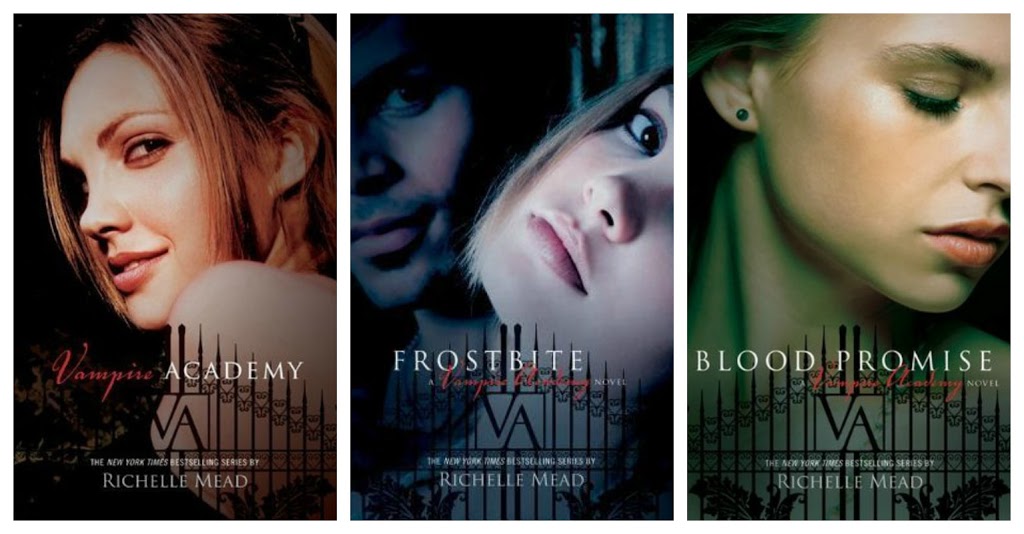
These are the original Vampire Academy series covers.
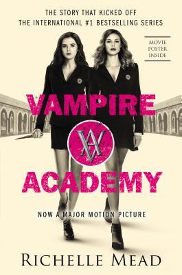
And these are the new revamped covers.

Let me start this off by saying that I have never really liked the original VA covers. They are really cheesy to me and just scream “I’m an angsty teenage girl!” And I could never tell if the girl on the cover was supposed to be Rose or Lissa. I just knew that she didn’t look how I imagined either of them. I was pretty excited when I hear that they were finally going to re-do the covers to coincide with the movie release.
As movie tie-in covers go, I really like this one. I love the colors and the logo is visible but not crazy huge. If you didn’t know that this was made into a movie, you might think it was a regular cover with two cover models on it. Thumbs up from me. I would totally get a copy if I didn’t already have a set.
Those are my thoughts on the new Vampire Academy covers. Let me know what you think below. Love them, hate them, bought them on e-book because they were so bad? And don’t forget to visit the other lovely bloggers participating ad well. Have a great weekend!


